App design · Delivery
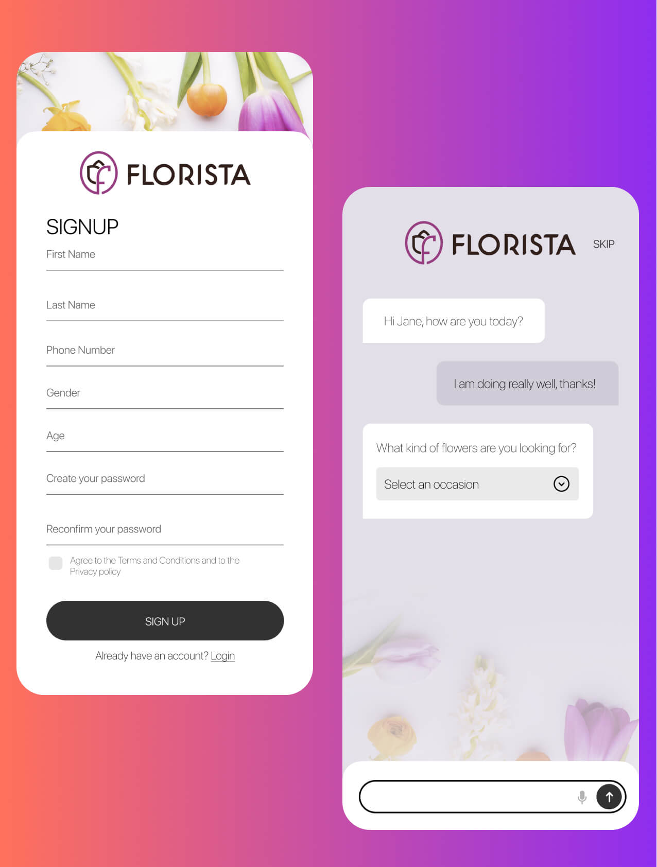
Flower delivery where the flowers are the product, the packaging and the pitch, so the interface stays out of their way.
Senior UI designer
Full app UI and design system
Figma system for the dev team
iOS & Android
The problem
Flowers are an impulse purchase made almost entirely on how they look. Unlike most delivery categories, the photograph is not a supporting detail. It is the entire product description. Any interface decision that makes the imagery smaller, busier or harder to read costs a sale directly.
The second problem is timing. Flowers are usually bought against a deadline: a birthday remembered late, an apology, a funeral. A checkout that takes too long doesn’t just annoy someone, it loses the order to whoever is faster.
A white interface so all the colour in the app comes from the product photography.
What I did
A clean white interface sounds like the safe option and here it was the deliberate one. Every colour in the app comes from the product photography, which means the flowers read as vivid without the imagery having to fight a background for attention.
The ordering UX was streamlined down to a handful of steps from browse to checkout, because the buying moment is short and often panicked. Fewer decisions between wanting and paying.
Everything was built as a Figma design system for the development team to work from, so new categories, occasions and seasonal ranges could be added later without a designer redrawing each one.
Browse to checkout in a handful of steps, then order tracking.
Start a project
Send the Figma, live product, deck or even a rough message. I’ll tell you what I think it needs, whether I’m the right fit and roughly what it’ll cost.
Usually reply within one working day · No sales call required