App design · NFT marketplace
An NFT discovery app with a click-through problem. Few screens, one job, and the interface was getting in the way of it.
UI designer
Redesign an underperforming UI
Full app UI, light and dark
iOS
The problem
Nifty Drops shows you the NFT drops worth looking at and sends you to where they can be bought. That’s the whole product. Click-through is not one metric among several; it is the business.
The existing UI was underperforming on exactly that number. With this few screens there was nowhere to hide a fix behind new features, which made the brief unusually clean: the interface either gets out of the way of the artwork and the buy, or it doesn’t.
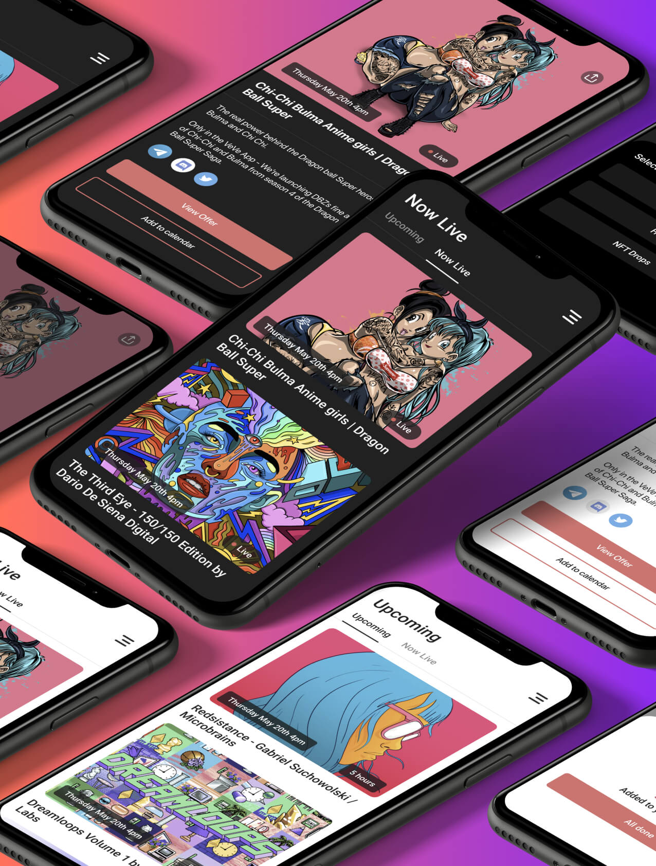
Artwork edge to edge and chrome cut back, with the interface doing as little as it can get away with.
What I did
People buy this on impulse and on sight. Every piece of interface competing with the image was costing attention, so I cut the chrome back hard and let the work run edge to edge as users scroll. The design does less on purpose.
The previous flow made you commit to an item before finding out how to act on it. I pulled the call to action up so it’s always present and always obvious. It takes only a few taps to move from seeing something to being where you can buy it, with no interpretation required.
Not a toggle bolted on afterwards. The whole point of the product is other people’s imagery, and imagery reads differently against light and dark. Both were designed as first-class states so the artwork holds up either way.
Light and dark designed as first-class states rather than a toggle added later.
Start a project
Send the Figma, live product, deck or even a rough message. I’ll tell you what I think it needs, whether I’m the right fit and roughly what it’ll cost.
Usually reply within one working day · No sales call required